Nuxt 베이스 프로젝트(4) - Buefy 활용해 UI 개발하기
기존 포스팅에서
- buefy 로 nuxt 프로젝트를 생성
- nuxt-property-decorator 모듈 설치
하였습니다.
이를 활용해서 아래와 같이 UI 컴포넌트들을 만들어 보려고 합니다.
- 여러 개의 layout 만들기
- 여러 개의 page 만들기
 URL : /user/login 레이아웃 : full.vue 사용 css : buefy, tailwind css |
 URL : /admin/menu1~3 레이아웃: admin.vue 사용 css : buefy |
전체 소스 코드는 여기 에서 확인하세요
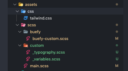
CSS 정의 하기
수정하거나 추가해야하는 css 파일 구조는 다음과 같습니다.
메인 칼라 및 블랙 칼라 지정하기
먼저 buefy-custom.scss 파일에서 메인 컬러 하나와 사용할 black 칼라를 지정합니다.
//assets/scss/buefy/buefy-custom.scss

// Import Bulma's core
@import '~bulma/sass/utilities/_all';

// Set your colors
$primary: #414fff;
$primary-invert: findColorInvert($primary);
$twitter: #4099ff;
$twitter-invert: findColorInvert($twitter);

$black: #434460;
$black-invert: findColorInvert($black);

// Setup $colors to use as bulma classes (e.g. 'is-twitter')
$colors: (
  'white': (
    $white,
    $black
  ),
  'black': (
    $black,
    $white
  ),
  'light': (
    $light,
    $light-invert
  ),
  'dark': (
    $dark,
    $dark-invert
  ),
  'primary': (
    $primary,
    $primary-invert
  ),
  'info': (
    $info,
    $info-invert
  ),
  'success': (
    $success,
    $success-invert
  ),
  'warning': (
    $warning,
    $warning-invert
  ),
  'danger': (
    $danger,
    $danger-invert
  ),
  'twitter': (
    $twitter,
    $twitter-invert
  )
);

// Links
$link: $primary;
$link-invert: $primary-invert;
$link-focus-border: $primary;


// Import Bulma and Buefy styles
@import '~bulma';
@import '~buefy/src/scss/buefy';

// 커스텀할 모듈
// @import "~bulma/sass/form/_all.sass";
// @import "~bulma/sass/components/navbar.sass;

@import '~bulma/sass/components/tabs.sass';

// Tabs
$tabs-link-padding: 10em 10em !default
글자 크기별 사이즈 조절
h1~h6의 글자 크기를 정하기 위해 typography.scss 파일과 variables.scss 파일을 작성합니다.
//assets/scss/custom/_variables.scss

$font-size-base: 1rem !default;

$h1-font-size: $font-size-base * 3.25;
$h2-font-size: $font-size-base * 1.74;
$h3-font-size: $font-size-base * 1.51;
$h4-font-size: $font-size-base * 1.32;
$h5-font-size: $font-size-base * 1.14;
$h6-font-size: $font-size-base;
//assets/scss/custom/_typography.scss

h1,
h2,
h3,
h4,
h5,
h6,
html {
  font-weight: 500
}

h1,
.h1 {
  font-size: $h1-font-size;
}
h2,
.h2 {
  font-size: $h2-font-size;
}
h3,
.h3 {
  font-size: $h3-font-size;
}
h4,
.h4 {
  font-size: $h4-font-size;
}
h5,
.h5 {
  font-size: $h5-font-size;
}
h6,
.h6 {
  font-size: $h6-font-size;
}
수정/작성한 CSS 적용
main.scss에서 위에서 작성한 css 파일을 적용하기 위해 import합니다.
//assets/scss/main.scss

@import "./custom/variables.scss";
@import "./buefy/buefy-custom";
@import "./custom/typography.scss";
레이아웃 만들기
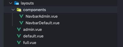
큰 프로젝트를 진행하다 보면, 다양한 레이아웃이 존재할 수 있습니다. 기본으로 사용하는 default.vue 파일 외에, 관리자용 레이아웃인 admin.vue 파일을 만들어 봅니다. 구조는 아래와 같습니다.
기본 네비게이션과 관리자용 네비게이션 분리
레이아웃 중에서도 최상단에 위치하는 네비게이션은 권한 등 여러 조건에 따라 달라지는 경우가 많습니다. 따라서 네비게이션은 종류별로 또는 property를 활용하여 컴포넌트화 해두는 것이 좋다고 생각합니다.
<!-- layouts/components/NavbarDefault.vue -->

<template>
  <nav
    class="navbar header has-shadow is-primary is-10"
    role="navigation"
    aria-label="main navigation"
  >
    <div class="navbar-brand">
      <a class="navbar-item" href="/">
        <img src="~assets/buefy.png" alt="Buefy" height="28" />
      </a>

      <div class="navbar-burger">
        <span />
        <span />
        <span />
      </div>
    </div>
  </nav>
</template>

<script>
export default {}
</script>

<style lang="scss" scoped></style>
<!-- layouts/components/NavbarAdmin.vue -->
<!-- buefy의 네비게이션 컴포넌트 활용 : https://buefy.org/documentation/navbar -->

<template>
  <b-navbar
    class="navbar header has-shadow is-primary is-10"
    role="navigation"
    aria-label="main navigation"
  >
    <template slot="brand">
      <a class="navbar-item" href="/">
        <img src="~assets/buefy.png" alt="Buefy" height="28" />
      </a>
    </template>
    <template slot="end">
      <b-navbar-item tag="div">
        <b-navbar-dropdown label="Info">
          <b-navbar-item href="#">
            About
          </b-navbar-item>
          <b-navbar-item href="#">
            Contact
          </b-navbar-item>
        </b-navbar-dropdown>
      </b-navbar-item>
    </template>
  </b-navbar>
</template>

<script>
export default {}
</script>

<style lang="scss" scoped></style>
기본 레이아웃 / 관리자용 레이아웃 / 전체화면 레이아웃
레이아웃은 기본/관리자용/전체화면으로 나눠 보려 합니다.
전체화면 레이아웃은 정중앙에 하나의 기능만 하는 페이지(로그인, 에러 등)를 위해서 사용하고,
관리자용 페이지는 로그인 후 볼 수 있는 페이지를 위해 사용합니다.
<!-- layouts/default.vue -->
<!-- 기본 제공되는 default.vue와 다른 것이 거의 없음.
             변경 사항 1. 이전에 작성한 default navbar 컴포넌트 활용
            변경 사항 2. nuxt-property-decorator 활용 -->

<template>
  <div>
    <navbar-default />

    <section class="main-content columns">
      <aside class="column is-2 section">
        <p class="menu-label is-hidden-touch">
          General
        </p>
        <ul class="menu-list">
          <li v-for="(item, key) of items" :key="key">
            <nuxt-link :to="item.to" exact-active-class="is-active">
              <b-icon :icon="item.icon" /> {{ item.title }}
            </nuxt-link>
          </li>
        </ul>
      </aside>

      <div class="container column is-10">
        <nuxt />
      </div>
    </section>
  </div>
</template>

<script lang="ts">
import { Vue, Component } from 'nuxt-property-decorator'

import NavbarDefault from './components/NavbarDefault.vue'
@Component({
  components: {
    NavbarDefault
  }
})
export default class DefaultLayout extends Vue {
  data() {
    return {
      items: [
        {
          title: 'Home',
          icon: 'home',
          to: { name: 'index' }
        },
        {
          title: 'Inspire',
          icon: 'lightbulb',
          to: { name: 'inspire' }
        }
      ]
    }
  }
}
</script>
<!-- layouts/admin.vue -->
<!--    1. 이전에 작성한 admin navbar 컴포넌트 활용
            2. nuxt-property-decorator 활용
            3. openTabContent 메소드로 router 처리되도록 함
            4. buefy 탭을 활용해 관리자용 메뉴 3개를 만듦 -->

<template>
  <div>
    <navbar-admin />
    <b-tabs
      v-model="activeTab"
      type="is-toggle-rounded"
      position="is-centered"
      size="is-small"
      class="block pt-3"
      @change="openTabContent(activeTab)"
    >
      <template v-for="(item, key) of items">
        <b-tab-item :key="key" :label="item.title" />
      </template>
    </b-tabs>

    <section class="main-content columns ">
      <div class="container column is-10 w-full">
        <nuxt />
      </div>
    </section>
  </div>
</template>

<script lang="ts">
import { Vue, Component } from 'nuxt-property-decorator'

import NavbarAdmin from './components/NavbarAdmin.vue'

@Component({
  components: {
    NavbarAdmin
  }
})
export default class AdminLayout extends Vue {
  activeTab = 0
  items = [
    {
      title: '메뉴1',
      to: { name: 'admin-menu1' }
    },
    {
      title: '메뉴2',
      to: { name: 'admin-menu2' }
    },
    {
      title: '메뉴3',
      to: { name: 'inspire' }
    }
  ]

  /**
   * public
   *
   */
  public openTabContent(index: number): void {
    this.$router.push(this.items[index].to)
  }
}
</script>

<style lang="scss" scoped>
/* buefy, vuesax 등에서 제공하는 컴포넌트 자체의 디자인적 요소 변경을 위해 /deep/ 사용 */
/deep/ .b-tabs .tab-content {
  padding: 0rem;
}
</style>
<!-- layouts/full.vue -->
<!--    1. full 레이아웃 내의 페이지는 컨텐츠가 정중앙에 위치하도록 함 -->

<template>
  <!-- tailwind css의 클래스인 h-screen를 적용하여, 브라우저 최대 height까지 영역이 되도록 함 -->
  <div class="columns is-centered is-vcentered h-screen">
    <nuxt />
  </div>
</template>

<script lang="ts">
import { Vue, Component } from 'nuxt-property-decorator'

@Component({})
export default class Default extends Vue {}
</script>

<style>
</style>
페이지 만들기
페이지마다 레이아웃을 적절히 적용하려 합니다. 구조는 아래와 같습니다.
관리자용 페이지 만들기
관리자용 레이아웃에 보면, buefy 탭을 활용하여 메뉴 3 개를 만들었습니다. 이 세 개의 메뉴 별로 페이지를 만들어 줍니다.
<!-- pages/admin/menu1/index.vue -->
<!-- URL : 도메인/admin/menu1 -->
<!-- 특징 1: Component 데코레이션에서 admin 레이아웃을 사용하겠다고 명시한다 -->

<template>
  <section class="section">
    <div class="columns is-mobile">
      <!-- Buefy 샘플 카드 1 -->
      <card title="Free" icon="github-circle">
        Open source on
        <a href="https://github.com/buefy/buefy">GitHub</a>
      </card>

      <!-- Buefy 샘플 카드 2 -->
      <card title="Responsive" icon="cellphone-link">
        <b class="has-text-grey">Every</b>
        component is responsive
      </card>

      <!-- Buefy 샘플 카드 3 -->
      <card title="Modern" icon="alert-decagram">
        Built with
        <a href="https://vuejs.org/">Vue.js</a>
        and
        <a href="http://bulma.io/">Bulma</a>
      </card>

      <!-- Buefy 샘플 카드 4 -->
      <card title="Lightweight" icon="arrange-bring-to-front"
        >No other internal dependency</card
      >
    </div>
  </section>
</template>

<script>
import { Vue, Component } from 'nuxt-property-decorator'
import Card from '~/components/Card'

@Component({
  name: 'FirstMenuPage',
  components: { Card },
  layout: 'admin'
})
export default class FirstMenuPage extends Vue {}
</script>
<!-- pages/admin/menu2.vue -->
<!-- URL : 도메인/admin/menu2 -->
<template>
  <section class="section">
    두번째 메뉴 섹션
  </section>
</template>

<script>
import { Vue, Component } from 'nuxt-property-decorator'
import Card from '~/components/Card'

@Component({
  name: 'SecondMenuPage',
  components: { Card },
  layout: 'admin'
})
export default class SecondMenuPage extends Vue {}
</script>
로그인 페이지 만들기
로그인 페이지는 full 레이아웃을 이용하여 만듭니다.
<!-- path : pages/user/login/index.vue -->

<template>
  <div class="card">
    <header class="card-header">
      <h1
        class="card-header-title has-text-primary has-text-weight-medium is-size-0 is-size-2-mobile"
      >
        로그인
      </h1>
    </header>
    <div class="card-content" style="background:#DFE3FF;">
      <p class="has-text-black">로그인 페이지입니다</p>
      <section>
        <b-field>
          <b-input placeholder="아이디" rounded></b-input>
        </b-field>
        <b-field>
          <b-input placeholder="비밀번호" rounded></b-input>
        </b-field>

        <div class="flex justify-end">
          <b-button type="is-primary" rounded>로그인</b-button>
        </div>
      </section>
    </div>
  </div>
</template>

<script lang="ts">
import { Vue, Component } from 'nuxt-property-decorator'
// import { userStore } from '@/store'

@Component({
  components: {},
  layout: 'full'
})
export default class Login extends Vue {}
</script>

<style></style>