Nuxt 베이스 프로젝트(2) - Buefy 커스텀 및 tailwind css 적용
웹사이트의 UI 작성을 위하여 Buefy 와 tailwind css 를 적용하려 합니다. Buefy 나 tailwind css 중 하나를 적용하지 않고 두 개를 적용하는 이유는 다음의 스텝으로 UI 개발을 진행하기 위함입니다.
-
UI 컴포넌트는 기본적으로 Buefy의 컴포넌트 활용
-
전체 테마는 assets/scss/buefy/buefy-custom.scss에 buefy 변수 작성
-
1차 커스터마이징은 기본 제공되는 Buefy 컴포넌트의 property 활용
-
2차 커스터마이징은 tailwind.config.js에 정의한 tailwind css를 활용해 클래스로 작성
1. Buefy 커스텀하기
buefy 는 커스텀을 위한 가이드가 잘 되어 있습니다. 추후 디자이너의 요구사항을 잘 반영할 수 있도록, Buefy 커스텀 전용 SCSS 파일을 만들겠습니다.
step 1. Sass 프리프로세서 사용을 위한 웹팩 로더 설치
Css 프리프로세서인 sass를 이용하기 위해 node-sass 와 sass-loader를 설치합니다.
npm install --save-dev node-sass sass-loaderstep 2. 폴더 및 파일 생성
-
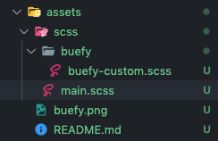
assets 폴더 내 scss 폴더를 생성합니다. 프로젝트 진행시 css와 scss를 혼용하여 사용할 경우에 대비하여, scss 전용 폴더로 분리하였습니다.
-
assets/scss 폴더 내에 buefy 폴더를 만든 후, buefy-custom.scss 파일을 만들어 줍니다.
-
assets/scss 폴더 내 main.scss 파일을 만들어줍니다. main.scss 파일은 프로젝트 내 분리되어 있는 scss를 import 하는 역할을 담당하도록 하였습니다.
step 3. 사용 설정
nuxt.config.js에 sass 사용하기 위한 파일을 등록합니다.
// nuxt.config.js

module.exports = {
	// ...

	css: [
    '@/assets/scss/main.scss'
  ]

  // ...
}
step 4. Buefy 커스터마이징
step2에서 만든 main.scss 에서는 다음과 같이 buefy-custom.scss 파일을 임포트합니다.
// assets/scss/main.scss

@import "./buefy/buefy-custom";
buefy-custom.scss 파일에서는 다음과 같이 buefy에서 제공하는 샘플 코드를 복사+붙여넣기 합니다.
// Import Bulma's core
@import '~bulma/sass/utilities/_all';

// Set your colors
$primary: #4c45ff;
$primary-invert: findColorInvert($primary);
$twitter: #4099ff;
$twitter-invert: findColorInvert($twitter);

// Setup $colors to use as bulma classes (e.g. 'is-twitter')
$colors: (
  'white': (
    $white,
    $black
  ),
  'black': (
    $black,
    $white
  ),
  'light': (
    $light,
    $light-invert
  ),
  'dark': (
    $dark,
    $dark-invert
  ),
  'primary': (
    $primary,
    $primary-invert
  ),
  'info': (
    $info,
    $info-invert
  ),
  'success': (
    $success,
    $success-invert
  ),
  'warning': (
    $warning,
    $warning-invert
  ),
  'danger': (
    $danger,
    $danger-invert
  ),
  'twitter': (
    $twitter,
    $twitter-invert
  )
);

// Links
$link: $primary;
$link-invert: $primary-invert;
$link-focus-border: $primary;

// Import Bulma and Buefy styles
@import '~bulma';
@import '~buefy/src/scss/buefy';
간단하게 주요 색상(primary) 색상을 블랙(#000000)으로 바꿔보면, 색상이 정상적으로 반영됨을 확인할 수 있습니다.
2. Tailwind CSS 이용
buefy 는 가볍고 커스텀하기 쉽지만, 더 디테일한 커스텀을 위해서 tailwind css를 적용합니다. 컴포넌트를 직접 정의하려면 위의 buefy는 사용하지 않고, Tailwind css 만 적용하여 활용해도 됩니다.
step 1. Nuxt 용 Tailwind css 설치
npm install --save-dev @nuxtjs/tailwindcssstep 2. 사용 설정
// nuxt.config.js

module.exports = {
	// ...

  buildModules: [
    // ...
    '@nuxtjs/tailwindcss'
  ],
  tailwindcss: {
    configPath: '~/config/tailwind.config.js',
    cssPath: '~/assets/css/tailwind.css',
    purgeCSSInDev: false,
    exposeConfig: false
  }

  // ...
}
step 3. assets/css 폴더 생성 후 assets/css/tailwind.css 파일 생성
tailwind css는 style 정의 없이 클래스로 쉽게 스타일을 정의할 수 있습니다. 여기서 사용하진 않지만, Purge css 는 사용하지 않는 불필요한 css 를 제거해 주는데, 이로 인해 tailwind css가 적용되지 않을 수 있습니다. 이를 해결하기 위해, 아래와 같은 파일을 생성하여 코드를 작성해주어, purgecss 가 무시할 수 있도록 합니다.
// ~/assets/css/tailwind.css

/* purgecss start ignore */
@import 'tailwindcss/base';
@import 'tailwindcss/components';
/* purgecss end ignore */
@import 'tailwindcss/utilities';
step 4. ~/tailwind.config.js 파일 생성
tailwind.config.js 파일에 사용할 스타일 클래스들을 정의할 수 있습니다.
/*

Tailwind - The Utility-First CSS Framework

A project by Adam Wathan (@adamwathan), Jonathan Reinink (@reinink),
David Hemphill (@davidhemphill) and Steve Schoger (@steveschoger).

Welcome to the Tailwind config file. This is where you can customize
Tailwind specifically for your project. Don't be intimidated by the
length of this file. It's really just a big JavaScript object and
we've done our very best to explain each section.

View the full documentation at https://tailwindcss.com.


|-------------------------------------------------------------------------------
| The default config
|-------------------------------------------------------------------------------
|
| This variable contains the default Tailwind config. You don't have
| to use it, but it can sometimes be helpful to have available. For
| example, you may choose to merge your custom configuration
| values with some of the Tailwind defaults.
|
*/

// let defaultConfig = require('tailwindcss/defaultConfig')

/*
|-------------------------------------------------------------------------------
| Colors                                    https://tailwindcss.com/docs/colors
|-------------------------------------------------------------------------------
|
| Here you can specify the colors used in your project. To get you started,
| we've provided a generous palette of great looking colors that are perfect
| for prototyping, but don't hesitate to change them for your project. You
| own these colors, nothing will break if you change everything about them.
|
| We've used literal color names ("red", "blue", etc.) for the default
| palette, but if you'd rather use functional names like "primary" and
| "secondary", or even a numeric scale like "100" and "200", go for it.
|
*/

module.exports = {
  important: true,
  // prefix: '',
  // separator: ':',

  theme: {
    /*
    |-----------------------------------------------------------------------------
    | Colors                                  https://tailwindcss.com/docs/colors
    |-----------------------------------------------------------------------------
    |
    | The color palette defined above is also assigned to the "colors" key of
    | your Tailwind config. This makes it easy to access them in your CSS
    | using Tailwind's config helper. For example:
    |
    | .error { color: config('colors.red') }
    |
    */

    colors: {
      primary: '#4c56ff'
    }
  }
}
step 5. 테스트
tailwind.config.js가 제대로 적용되었는지 확인해보겠습니다.
Vue 파일 중 template 위치에 위에서 적용한 primary 를 텍스트해 적용해볼 수 있습니다.
<div class="text-primary">반갑습니다</div>